In what ways do your media products use, develop or challenge forms and conventions of real media products?
For my first evaluation task I will evaluate my music video, my website and my CD digi pak pointing out the areas that we used forms and conventions.
Thursday, 16 January 2014
Wednesday, 15 January 2014

Tuesday, 14 January 2014
evaluation tast 1 (CD)
After designing our CD digipak we made sure that they had the main things that occur on normal CD covers so that it looks realistic and professional.
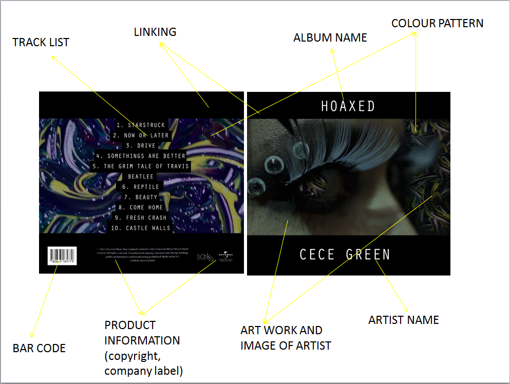


We put the artist name and album name titles in capital as it draws attention to it straight away which is very important. I also think that putting a black frame with white writing is very effecting as it stands out more which would be more effective when selling the album. I also think that the art work is really effective as it creates a theme across the CD pack, artwork can sell an album as it usually links to the target audience, our artwork is very unusual and alternative which is what our artist is which is why I think it works well. We also kept the theme of white writing on black on the back when writing on the track list, we did a conventional amount of tracks which is usually 10-12 tracks unless is it a single. We also put on everything else that you would usually expect to see on the back of a CD like the barcode, product information ect. Another thing that we kept conventional is that we kept the font the same throughout the CD as this looks more professional and realistic.
This is little boots front cover of her album, you can see the similarities between what she has on the front of our cover as hers. Our CD digi pak is convensional because we have all the things that you would expect to see on a CD. This makes it more appealing to the audiences because it looks professional.
This is our final product, you can see the two images that we are putting inside the case which are the two outside image as they fold in. We didn't want our front and back to be have the same theme as the inside images as I think because they are quite strong colours we wanted the inside to be more calm. We took very alternative images for the inside as we are looking to target very alternative audiences.
Wednesday, 8 January 2014


Wednesday, 11 December 2013
Editing

To start the editing process we we had to make sure the lip syncing fitted in with the beat and synced with the track, we also made a rough copy to start with as a base so we new where all the main parts fitted in. When we began to edit we decided that we wanted to test our photoshop ability and test ourselves so we created a 'monster; using a silhouette of a man, octopus tentacles and spider legs. We put this in because we wanted to create a feel of extra presences with in the woods almost like she is being watch.
How we made the frozen effect:
When editing we used the blade tol to cut up the part of clips to create a jumpy jittery effect during the video.


Whilst editing we realised that some of the clips from the studio and the woods were different colour temperatures which meant that we put a blue/green filter on the clips to keep the colour the same, we went for blue/green because they are very cold dark colours which gave a really good eerie feel to it.
Sunday, 1 December 2013
Website ideas


We linked her Facebook page and twitter page to the homepage so that if some of her audience want to follow her there they can.
we realised the more places we published her work in the better it was as people share and like her work.


These are some of the thsirt designs that we created on a website, this allows her fans to interact with her as well as promoting and selling our artist
Subscribe to:
Posts (Atom)