Friday, 31 January 2014
Task 3- Focus group video
What have I learnt from my audience feed back?
We learnt as a group that we achieved the eerie effects that we hoped to get although some people said that the editing got a bit too repetitive and thought that the jumpy part could have been cut down slightly. We were also happy with our response that we got from the website and CD digi pack and how they all relate together and work well selling the over all product. We were told that people like our video because it unconventional and different to anything which made it more interesting as people like unique and alternative things.
Thursday, 30 January 2014
Wednesday, 29 January 2014
Monday, 27 January 2014
Task 3: audience feed back questions for Survey Monkey
These are our audience feed back questions which will we will use to ask various different people This questions we created a survey monkey and sent them round on email. We used questions that would relate to all parts of our course work including the video, CD digi pack and the website so that we could have a full understanding of what went wrong and right. In the survey monkey we left a large box for comments so that the people who were giving feed back could say as much as they needed.
- What aspects do you like about the video?
- Do you think the lighting was effective in creating an eerie feel?
- Do you think the locations used where effective in creating a creepy feel?
- Was there any parts of the video you didn't like?
- Do you think the website represents the artist well?
- Would you by the CD Digi Pak if you saw it in a shop?
- What design elements do you like on the Digi Pak?
- Does it remain you of any similar artist?
- Would you subscribe to to their channel?
- What are your favourite elements of the music video?
- How effective do you think the campaign is?
- What do you think of the special effects?
These are some of the responses that we got from the survey. We were overall pleased with the responses that we got from the survey, it was also interesting to see what parts people like and did not, most things people picked up on was that they liked the editing and how alternative and different the video was which is what we were looking for. We were also happy with some of the responses about how the digi pack and the website also reflect well with the video which shows us that it looks professional and therefore would have success in the industry.
Task 3: Focus group
Taask 3: Survey monkey
click here to fill out out our survey!!
We have created a survey monkey and sent it out to various different people on email, some out target audiences and some not so we can see the contrast between them.
This is a good way to get annonminous feed back from our music video.
We are waiting for the feed back now
Friday, 24 January 2014
Thursday, 16 January 2014
Evaluation Task 1
In what ways do your media products use, develop or challenge forms and conventions of real media products?
For my first evaluation task I will evaluate my music video, my website and my CD digi pak pointing out the areas that we used forms and conventions.
For my first evaluation task I will evaluate my music video, my website and my CD digi pak pointing out the areas that we used forms and conventions.
Wednesday, 15 January 2014
Tuesday, 14 January 2014
evaluation tast 1 (CD)
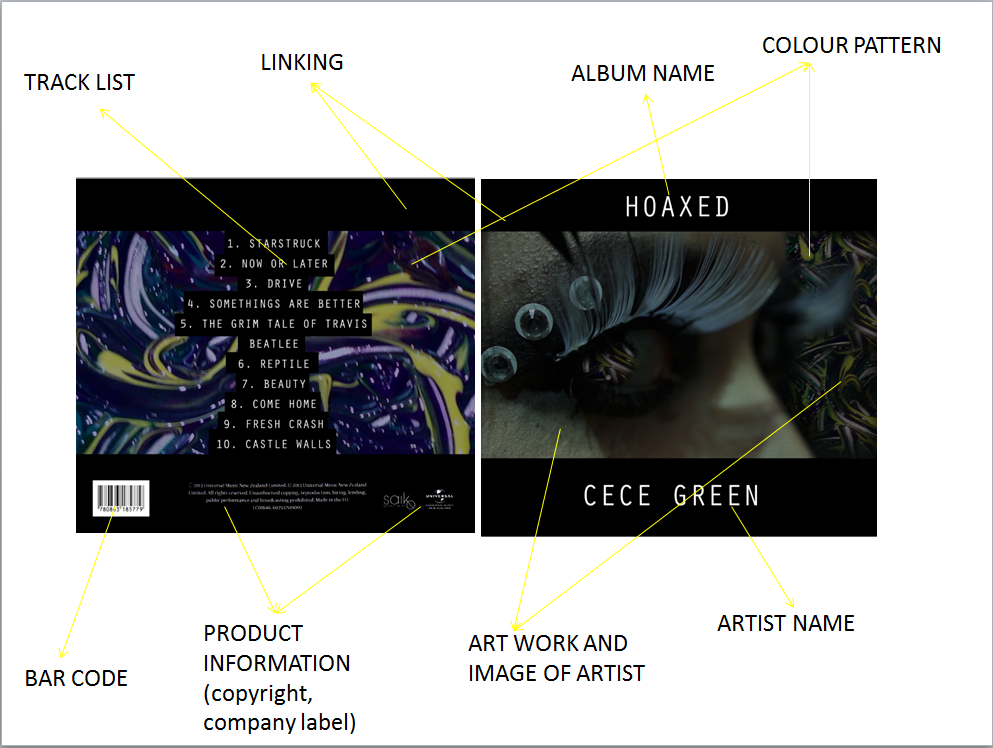
After designing our CD digipak we made sure that they had the main things that occur on normal CD covers so that it looks realistic and professional.
We put the artist name and album name titles in capital as it draws attention to it straight away which is very important. I also think that putting a black frame with white writing is very effecting as it stands out more which would be more effective when selling the album. I also think that the art work is really effective as it creates a theme across the CD pack, artwork can sell an album as it usually links to the target audience, our artwork is very unusual and alternative which is what our artist is which is why I think it works well. We also kept the theme of white writing on black on the back when writing on the track list, we did a conventional amount of tracks which is usually 10-12 tracks unless is it a single. We also put on everything else that you would usually expect to see on the back of a CD like the barcode, product information ect. Another thing that we kept conventional is that we kept the font the same throughout the CD as this looks more professional and realistic.
This is little boots front cover of her album, you can see the similarities between what she has on the front of our cover as hers. Our CD digi pak is convensional because we have all the things that you would expect to see on a CD. This makes it more appealing to the audiences because it looks professional.
This is our final product, you can see the two images that we are putting inside the case which are the two outside image as they fold in. We didn't want our front and back to be have the same theme as the inside images as I think because they are quite strong colours we wanted the inside to be more calm. We took very alternative images for the inside as we are looking to target very alternative audiences.
Wednesday, 8 January 2014
Subscribe to:
Comments (Atom)


